MobLab
Role:
User Experience Designer
Responsibilities:
-
User Interviews
-
Research
-
Visual & Interaction Designs
-
Prototyping
-
Usability Testing
Outcome:
A refined product tour and a revitalized platform outlook, leading to enhanced user engagement and satisfaction.

Overview
About MobLab:
MobLab is at the forefront of educational innovation, developing games and experiments centered around economics and management tailored for high schools and colleges. Its dynamic platform is a staple in hundreds of classrooms, augmenting traditional lectures with immersive activities that champion hands-on learning, where students engage, participate, and explore core concepts actively.
My Role and Objective:
Stepping into this transformative journey as a User Experience Designer, I was presented with the unique challenge and opportunity to redefine and elevate MobLab's platform experience. This wasn't just about aesthetics; it was about ensuring the platform's usability matched its educational ambitions. With a myriad of responsibilities, from diving deep into user interviews to prototyping intuitive designs, my primary objective was twofold:
1. Optimizing the Product Tour: Making the first impression count by creating a product tour that is not just informative but also engaging, ensuring users can grasp the platform's value right from the outset.
2. Revitalizing the Platform Aesthetics: Beyond functionality, the look and feel of a platform play a pivotal role in user satisfaction. The aim was to refine the platform's outlook, making it more contemporary and user-friendly.
Problem Statement
User Churn Post-Onboarding:
MobLab enjoyed a robust number of initial sign-ups, but this success was overshadowed by a troubling trend: a substantial user drop-off shortly after onboarding. This increasing churn rate became an alarm for the Sales and Product teams, signaling a pressing need to rectify the user experience and enhance retention strategies.
Objective
Elevate User Retention Through Data-Driven Insights:
In this pivotal phase, our goal was crystal clear: harness data-driven insights to unveil the hurdles faced by users during the initial onboarding process. Through rigorous user research, both quantitative and qualitative, we intended to zero in on solutions addressing these issues. At the heart of our efforts was the ambition to architect a design transformation that would boost user retention, offering a lasting and captivating user experience.
Project Scope & Breakdown
-
Guided the UX Design Journey: Spearheaded the UX design initiative to uplift the user experience and tackle the retention challenges head-on.
-
Heuristic Analysis: Executed an exhaustive heuristic assessment to shine light on the onboarding experiences of new users and underline the key pain points.
-
Strategic Roadmap: Leveraged insights from our research to chart out a strategic pathway focused on enhancing user engagement and overall platform intuitiveness.
Phase 1 - Discovery:
-
Executed comprehensive user interviews and heuristic evaluations.
-
Distilled user-centric insights to steer the design direction and solution prioritization.
Phase 2 - Ideation:
-
Cultivated creative solutions via collaborative brainstorming and mind-mapping.
-
Strategically addressed the challenges unearthed during the discovery phase.
Phase 3 - Prototyping:
-
Conceived low-fidelity prototypes, enabling swift iterations and concept testing.
-
Engaged users for feedback, honing the prototypes for an optimal experience.
Phase 4 - Iterative Testing:
-
Undertook usability tests with users, validating design choices and collating prototype feedback.
-
Steadily refined the designs, drawing from user feedback and usability findings.
Phase 5 - Design Refinement:
-
Synthesized user input and insights to craft polished, high-fidelity designs
-
Concentrated on delivering a user experience marked by seamlessness and delight.
Phase 6 - Final Validation:
-
Rolled out further usability tests, ensuring that the culminating designs aligned with user aspirations and requirements.
-
Incorporated final touch-ups and adjustments prior to green-lighting the solution for deployment.
Research
Existing Long-Term Users:
-
Interview Process: Engaged in comprehensive interviews with long-standing users to delve deep into their experiences, challenges, and wishlist for platform enhancements.
-
Key Discoveries:
-
The platform's initial impression was that of complexity, lacking adequate guidance, resulting in user disorientation.
-
Voiced a need for refined functionality, particularly around student interactions and assignments, yearning for a more streamlined process.
-
A trend emerged indicating users preferred mastering the platform independently before initiating contact with sales, highlighting a preference for a self-driven onboarding journey.
-
New Sign-Ups:
-
Feedback Collection: Approached recent platform adopters to comprehend their experiences and reasons behind their potential drop-offs.
-
Salient Findings:
-
The platform's navigation felt cumbersome, often demanding multiple steps, obstructing users from promptly accessing distinct features.
-
An overriding sentiment for a more intuitive user experience emerged, emphasizing the essence of fluidity in interactions.
-
Tasks central to student management and assignment execution felt protracted and inefficient.
-
Users expressed an inclination to gain preliminary platform knowledge before establishing a connection with the sales team.
-
While the platform was feature-rich, its navigation posed challenges, preventing straightforward task execution.
-
Navigating the platform seemed too complicated without assistance.
Performing tasks related to students and assignments required too many steps.
I preferred having some initial understanding before reaching out to sales.
While all the necessary features were available, navigating the platform to meet my needs wasn't straightforward.
User Persona
Harnessing the rich data procured from exhaustive interviews with both seasoned and recent users, a comprehensive user persona was sculpted. This persona became the linchpin in our design odyssey, offering:
-
Shared Vision: Cultivated a unified understanding of our users across the team, ensuring aligned efforts.
-
User-Centric Insights: Threw light on distinct user behaviors and requirements, acting as the compass for our design choices.
-
Fruitful Conversations: Augmented the quality of team discussions, making them more user-focused.
-
Empathy in Discussions: Propelled team discussions away from insular viewpoints, anchoring them in genuine user needs and aspirations.

Goals:
Our primary goal was to seamlessly integrate the intrinsic product value with user expectations, thus addressing the core challenges. These were:
-
Value Perception: Users struggled to discern the inherent value of the platform.
-
Awareness Gaps: There was a general unawareness of the breadth of platform functionalities.
-
Navigational Challenges: Users found the platform's navigation labyrinthine and non-intuitive.

Now-How-Wow Matrix
To strategically address these challenges while working within the constraints of a compact team and finite developmental resources, we emphasized the following domains:
Class Creation:
We honed in on pivotal elements such as naming the class, selecting subjects, curating playlists, and student invitations. Simplifying this flow was key to augmenting user engagement during their initial interactions.
Bifurcated Onboarding:
Recognizing the pivotal role of onboarding, we split it into two tiers. The primary stage employed a "learn-as-you-go" philosophy, gently familiarizing users with platform nuances. The secondary phase facilitated deeper dives with the sales team, thus ensuring a rounded onboarding experience.
Premier Membership Trial:
To engender trust and offer a transparent view into platform strengths, we rolled out a free premier membership trial. This demo phase enabled users to fully grasp the platform's breadth before a full commitment.
Enhanced Student Visibility:
Addressing core instructor needs, we accentuated features like student invites, rosters, and grade books. This ensured educators had an unobstructed view of student progress, bolstering their efficacy.
Integrated Calendar:
With the debut of a class-centric calendar, we showcased live schedules and critical assignment milestones. This tool was designed to optimize instructor class management and keep students abreast of impending commitments.
UI Tweaks:
For visual symmetry and an elevated user experience, we carried out nuanced UI refinements. These spanned color palette adjustments, fresh card designs, enriched illustrations, and interactive boosts, all in tandem with the extant design ethos.
Mind Mapping
As part of the ideation process, I curated a mind map. This tool was pivotal in brainstorming, structuring emerging ideas, and discerning interrelations amongst the collated user feedback and insights.


Revamping the Onboarding Experience
The redesigned onboarding process was meticulously curated, addressing specific pain points and creating a seamless introductory experience for new users.
-
Value Proposition: The streamlined product tour was both informative yet succinct, ensuring users weren't inundated with excess information right off the bat.
-
Aha! Moment: Post-sign-up, users were promptly ushered into an immersive game, allowing them to view from both an instructor's and student's perspective, culminating in tangible results. This hands-on exposure was pivotal in highlighting the platform's core offerings.
-
Effortless Onboarding: A "learn-by-doing" ethos was infused into the onboarding, walking users through the platform intricacies by guiding them in setting up their inaugural class.
-
Personalization, Warm Design: The prior interface was notably impersonal. In contrast, the revamped design exuded warmth and was tailored to resonate with individual user preferences.
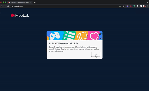
1. Greeting & Game Introduction:
Upon login, users were warmly greeted by name and prompted to indulge in a game, underpinning how the platform could elevate their students' understanding of economics. A design uplift ensured users weren't left adrift post-sign-up, offering clear prompts and the autonomy to skip or exit the process at will.

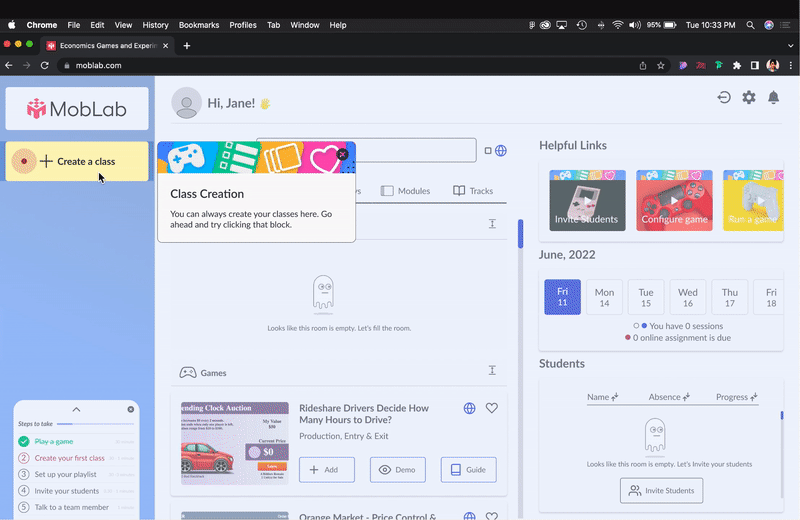
2. Class Creation Personalization:
In line with the heightened personalization focus, users were presented with a curated topic selection. Additionally, the revamped design eschewed the premature package selection dilemma, offering a free trial code instead, ensuring users could experience the platform's full breadth before making an informed decision.

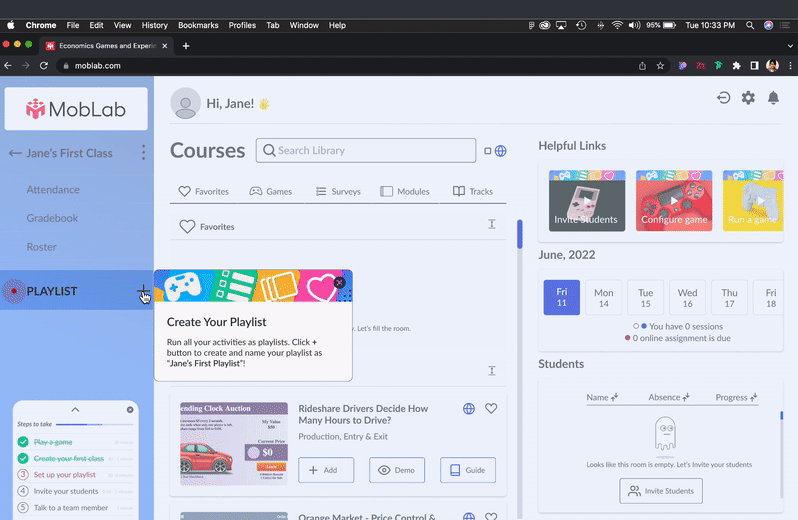
3. Deciphering Playlist Creation
The refreshed interface clearly demystified what playlists were and the mechanics of curating one, providing clarity where the previous design was ambiguous.

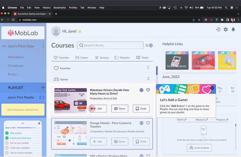
4. Intuitive Game Addition:
The redesigned interface nudged users to integrate games, with explicit, always-visible options—'Add', 'Demo', and 'Guide'. Earlier, these options were ambiguously revealed only on hover. Enlarged cards paired with concise descriptors facilitated user choices.

5. Streamlined Student Invitation:
The process of inviting students was overhauled for simplicity, presenting users with an array of intuitive options: Bulk email dispatch, QR code sharing, or CSV file uploads. Once dispatched, the platform now showcased a default student list, highlighting pending invitations, fostering better user oversight.

Usability Testing & Iteration
User-Centric Testing Approach:
Usability testing played a pivotal role in refining our design, ensuring it not only looked good but functioned seamlessly. With ten previous and existing users involved, we created an environment to observe genuine interactions, examining users' verbal feedback, and discerning non-verbal cues through facial expressions during their journey on the enhanced product tour.
Post-test surveys further gauged users' sentiment, asking pointed questions about their likelihood to integrate the platform in their teaching and seeking feedback for future enhancements.
Promising Outcomes:
-
Task Accomplishment: Saw a substantial rise, with an impressive 90% uptick during testing.
-
Efficiency in Task Completion: The time taken for users to complete tasks halved, indicating an intuitively designed flow.
-
Platform Adoption: Anticipation for using the platform in educational settings swelled to 80%. It's worth noting the remaining 20% abstention was primarily due to budgetary constraints of institutions, rather than platform design or functionality concerns.
Reflecting on the Journey and The Road Ahead
Embarking on this project, the overarching goal was to make a user-centric platform. Looking back, the measure of success was evident in our inclusion of users throughout the design and iteration process, ensuring the final design resonated with their real-world needs.
However, while this project's outcomes are promising, it's currently in a hiatus due to staffing constraints. Despite this temporary pause, the design has received the nod for future implementation. We remain cognizant of the evolving landscape of user needs, understanding that as time lapses, a fresh round of testing might be imperative to ensure the design remains relevant and meets users' evolving expectation.

