Goalswell
Checklist Usability Enhancement
As a User Experience Designer at Goalswell, my project focused on enhancing the usability of our checklist feature. The initiative aimed to streamline the user experience, specifically targeting the editing, navigation, and management of checklists within our application. This project was driven by user feedback indicating several usability challenges that hindered efficient task management.

Challenges
-
Complex Navigation: Users found the checklist navigation confusing, particularly when editing tasks.
-
Limited Functionality: The inability to efficiently manage and sort checklist items hampered user productivity.
-
Aesthetic Inconsistencies: The visual design of the checklist did not align with modern usability standards, detracting from the overall user experience.


Objectives
-
Simplify the user interface to ensure intuitive navigation.
-
Introduce enhanced sorting capabilities to manage tasks effectively.
-
Revise the visual design to improve aesthetic appeal and functional alignment.
Process & Improvements
-
User Research: Conducted detailed interviews to gather direct feedback on the existing challenges.
-
Prototyping: Iteratively designed and tested multiple prototypes to address specific usability issues identified during research.
-
Usability Testing: Implemented rigorous testing phases to refine navigation and interaction, ensuring the solutions met user expectations.


Implementation & Updates
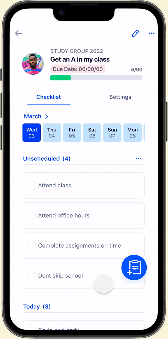
Date and Card Adjustments: The usability tests revealed that the checklist interface was not optimally supporting task review and update processes due to small touch targets and cramped display. The design was overhauled to feature larger touch areas and a more spacious card design, allowing for easier interaction, especially on mobile devices.

Implementation & Updates
Add Button and Filters: Feedback indicated that users struggled with adding new checklist items quickly and sorting existing tasks efficiently. We introduced a prominently displayed 'Add' button and incorporated powerful filters that allow users to view tasks by categories such as "All", "This Month", "Overdue", and "Completed".

Implementation & Updates
Editing Checklist Items: Users previously faced difficulties in editing checklist items, particularly in distinguishing between tasks set for one-time execution versus recurring tasks. The solution was to redefine the interface for setting dates, introducing clear toggles for "One Time" and "Recurring" options, simplifying the user experience and minimizing confusion.

Final Usability Testing Results
Comprehension and Execution:
-
Success Rate: 73% (22 out of 30 participants) were able to understand and follow the steps effortlessly, indicating a significant improvement in the app’s usability and intuitive design.
Efficiency Gains:
-
Time Reduction: The average completion time for tasks was reduced from over 3 minutes to just 1 minute, indicating a substantial decrease in time required, which enhances user efficiency.
User Satisfaction:
-
High Satisfaction: 73% of participants expressed high satisfaction with the redesign, reinforcing the effectiveness of the interface improvements.
-
Effectiveness Validation: 80% (8 out of 10) of participants from prior testing sessions reported that the improvements were highly effective, validating the iterative design process and its focus on user-centric enhancements.
Conclusion
The checklist usability enhancement project at Goalswell significantly improved the user experience by addressing critical usability issues identified through user feedback. The iterative design process, informed by direct user interaction and testing, led to practical solutions that were well-received by our user base, thereby enhancing overall productivity and user satisfaction.

