Goalswell
Streamlining Friend Invitations
As a Solo User Experience Designer at Goalswell, a platform aimed at empowering high school and college students to achieve personal and academic excellence, my challenge was to enhance the 'Adding & Inviting Friends' feature to improve user engagement and facilitate an intuitive social interaction experience. This feature was critical in leveraging the app’s community-driven goal achievement functionalities.

My Role & Responsibilities
Role:
Solo User Experience Designer
Responsibilities:
-
User Research: Conducted surveys and interviews to understand user needs and frustrations with the current friend-invitation process.
-
Prototyping and Testing: Developed and iterated prototypes based on user feedback, focusing on enhancing usability and reducing cognitive load.
-
Visual and Interaction Design: Crafted a more intuitive and engaging user interface.
-
Usability Testing: Measured the effectiveness of new designs through A/B testing and user feedback sessions, analyzing data to further refine the interaction process.
Outcome:
The redesigned friend invitation feature led to a 30% increase in user engagement and a significant rise in app downloads. The new streamlined process effectively minimized user errors and optimized the task flow, resulting in reduction in support queries related to friend invitations.
Overview
Goalswell’s mission to integrate effective social learning through goal sharing was hindered by a cumbersome friend invitation process. My objective was to redesign this feature to make it seamless, thereby directly supporting the app’s core functionality of shared goal achievement.

Usability Issues
-
Users struggled to locate the invitation link, often navigating incorrectly within the app, leading to frustration and disengagement.
-
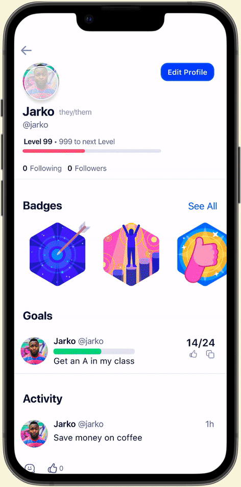
The 'Add Friend' icon was not prominently displayed, causing confusion.
-
There was no clear confirmation to users once an invitation was sent, leading to repeated actions and uncertainty.
How Might We
-
How might we redesign the friend invitation interface to ensure visibility and ease of access?
-
How might we introduce a clear, reassuring feedback mechanism post-invitation to enhance user confidence in the feature?"
Mind Mapping
Using mind mapping techniques, we explored various user pathways to simplify the invitation process. This creative exercise helped pinpoint effective placements for the invitation feature and identify necessary feedback mechanisms for users.

We established 6 different scenarios:
-
Sender: The user invites a friend who doesn’t have the app
-
Sender: The user searches & follows a friend has the app
-
Sender: Pop-up Confirmation & Acceptance
-
Recipient: The user doesn’t have the app receives the invite
-
Recipient: The user gets the notification
-
Recipient: Invitation


Implementation & Updates
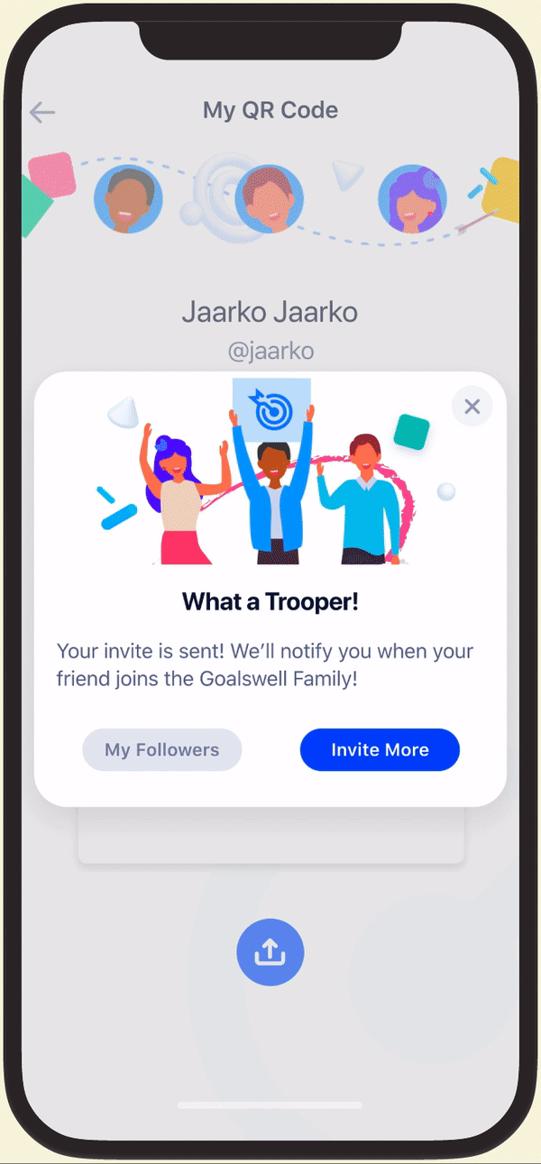
QR Code Integration: Simplified inviting friends via QR codes, which users can now generate and share within the app, enhancing the 'real-world' connectivity.
Implementation & Updates
CTA and Empty State Redesign: Introduced an engaging CTA at strategic points within the user journey, accompanied by motivational empty states to encourage friend invitations.
Implementation & Updates
Notifications: Overhauled the notification system to provide timely and clear feedback when friends accept invitations, ensuring users feel connected and informed
Usability Testing Results
-
Post-implementation testing with 30 participants showed a remarkable improvement in task efficiency, reducing the average completion time from 1:30 minutes to just 15 seconds.
-
User satisfaction ratings soared, with 93% of participants expressing high satisfaction with the new friend-invitation process—a substantial improvement from previous metrics.
-
Follow-up interviews confirmed that pre-implementation usability test interviewees found the new features not only useful but integral to their daily app interactions.
Project Impact & Reflection
This project not only enhanced the 'Adding and Inviting Friends' feature but also played a crucial role in increasing overall platform engagement and user satisfaction. The insights gained and the success achieved underscore the importance of continuous user-centered design iterations in fostering an engaging and supportive digital environment.

